Skip to content

The Scenic Route of Design: A Case Study

This is a case study into the scenic route of design.  When approaching what seems to be the simplest project, I can easily find myself going on a long journey through several drafts, eliminating “what not to do”, traveling from simple to elaborate and back again, hopefully emerging into a struck balance of good design, clear messaging and mass-appeal.  Easier said than done.

Greyhouse Coffee & Supply Co. wanted to design new t-shirt for the holidays, adhering very closely to it’s values and brand.  The coffee shop avoids being over-stated, and prefers subtleties and sensibilities that lend themselves to projecting a degree of artistry, as well as seriousness in coffee and community.  Below is the progressive journey that lead to the final design

Draft #1

Draft #1

It started with this concept, the shape of a latte mug & saucer masked over a watercolor stroke.  It’s simple, even only implying a cup with it’s unfinished handle.  Even the saucer is simply suggested with a rough edge and hand-drawn gap between.

Yet, it wasn’t quite saying enough.  It was a cup without a real message.  For now, it was just an icon.

Draft #2

Draft #2

So, we decided to make a character out of the cup by making it one of Greyhouse’s signature drinks, The Grey Capp.  Floating about the mug are the ingredients to a Grey Capp: a double ristretto espresso, textured milk, and a third ingredient that reflects Greyhouse’s values: a shared conversation.

Again, paint strokes were used as convey each layer, each with a unique color.  However, screen printing can be tricky, since you’re charged for every color.  So, I made up my mind to limit the design to three colors at the most, while also pulling in the dark grey of the shirt as a no-cost fourth color.  White would be repeated from the mug to the textured milk, as well as under the brighter colors in order to make them stand out more vividly.

Draft #3

Draft #3

The design was getting to be a bit too vertical, pushing the cup and Greyhouse logo toward the belly with the paint stroked ingredients threatening the neckline.  The strokes were then compressed, squaring-off the entire design.  In the end, however, it started looking like instructions on making a cheeseburger.  Back to the drawing board.

Draft #4

Draft #4

I was then inspired by a surf shirt that brought in a gradient of orange and pale yellow that stretched from top to bottom.  It was risky and bold.  I utilized a vectorized stock image to convey motion and energy, as well as fluidity.  I found these colors and textures could still be accomplished with only three colors.  This is the point I started shopping it around to other creatives and Greyhouse staff.  I got a lot of “oohs” and “ahhs” on first impression.  But when I asked if they would buy it and wear it, I got a lot of hesitations.  That goes to show two things: 1) do your market research by asking the right people the right questions.  2) A good design isn’t good enough.  People need to be willing to attached themselves to it, endorse it and wear it.

Draft #5
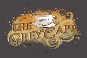
Draft #5

I re-visited this idea of making this a “Grey Capp” shirt by tapping into the fans of Greyhouse, and their sentimental attachment to the shop’s uniqueness.  In this version, I made more of a spectacle of the design, creating the drink in to a sort of character.  Again, I got a lot of excellent first impressions, followed by immediate hesitations.  A lot of people just didn’t feel it would have mass-appeal when you consider that a lot of people are still frightened of espresso, or if they do drink espresso their favorite drink may not be the Grey Capp.  It would appeal to a very limited demographic.

Draft #6
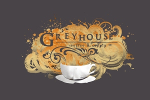
Draft #6

Leaving the idea of the Grey Capp behind I decided to create something that celebrated, not only coffee, but the kind of coffee experience you could only find at Greyhouse.  So, I made the graphic burst from the brim of the mug, consuming it with the Greyhouse logo knocked-out across it.  A couple other creatives were really leery of how swirly it was, because it reflected so many typical trends in design that simply throw noise on an image and call it artistic.  That hurt a little bit, but you need to have a bit of a thick skin if you want to get it right.  At this point, I remembered that really good design is actually quite simple in its execution.  I really wanted to back this off.  It seemed like it was trying too hard.  It was too desperate.

Draft #7

Draft #7

In an attempt to go in a different direction, a few accidental discoveries happened resulting in the above image.  It was actually in the presence of some of my friends, and everyone’s eyes got big, followed by an “ooh”.  I wish I could say it was my creative genius and artistic intuition.  No, it was me simply erasing one layer, then accidentally turning off another layer and *poof*.  I believe the positive response had less to do with great design and more to do with the relief everyone felt my leaving the former draft, which was so busy and heavy.  This, however, needed some refinement.

Final Design
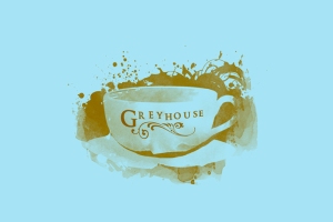
Final Design

So I came full-circle, as I suspected I would.  I went back to that first image of the mug & saucer.  I infused it with the knocked-out splash and added a few more hand-done elements.  I believe it strikes the balance.  It contains coffee iconography, yet keeps it subtle, or perhaps only implies it.  It’s artistic without being showy.  It doesn’t scream, but it certainly whispers.  It showcases the shop’s logo, while projecting certain values about itself.  And finally, it offers a mass-appeal.  People want to wear it.  The shirt-color is still debatable at this point.

And so, what did I learn today?  Absolutely nothing.  There is no formula or magic trick.  Design is dirty.  You’re gonna have to get your hands in it and make a lot of presumptions and mistakes along the way.  It often costs me so many ideas that will never be used, in order to create something that hits the target.  Maybe accepting that is the take-away.

To those needing design work, whether it be a logo, postcard or a shirt design:  Be willing to hire someone who is willing to take the scenic route of design, and struggle to get it right.  It’s worth every penny.

A Great Idea: Folded Business Cards

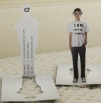
A folded business card is the perfect option when you have too much to say for standard business cards.  They allow you to have the space of a postcard neatly folded into fit a wallet.  They can also be used as ‘mini table tents’ advertising a new product offering or limited time special.

Several of my clients prefer them, not only because make a great impression, but because they are able to communicate so much in such four panels.  If you’re interested in hearing more about Raygun’s folded business cards, please contact me.

Cassette Tape Art

I’d like to introduce an artist who uses recycled materials to create amazing artworks, that is Erika Iris Simmons. She is a self-taught artist who works with non-traditional media. Most of her materials have been discarded or donated at some point.  Erika Iris Simmons has made a number of portraits out of recycled cassette tapes, old film and reels, stopwatches and pieces of related pictures. She even carves on medley poker. Isn’t that crazy? and really amazing, I have to say. The following are some of her works, enjoy!

The Shirt You Print On Is Critical

I have a client who ordered shirts for a fundraising campaign.  Here’s what she said about the choice of shirt decided to print on:

I must stay with the American Apparel track shirt!!!!! This is why so many people want more of the shirts! A friend’s husband changes into his every day after work…People want to live in them. I have to only allow myself to wear mine once a week, and I look forward to it!”

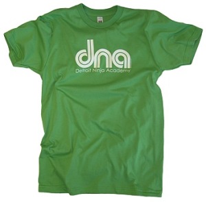
I think that comment should convince anyone that the quality of shirt you choose print on makes all the difference in the world.  Most often when clients inquire about t-shirts, they request the most inexpensive choice of shirt brand I carry.  Look, I don’t carry anything “cheap”, but I certainly have more economical selections available.  I must say, however, that a fantastic design printed on a poor-quality shirt is like a really good movie with a really bad soundtrack.  It lacks the entire package.  A good design and a good shirt go great together.

With all the money and creativity that clients put into t-shirts, it’s a shame that most of them end up being worn to paint the house or mow the lawn.  That fate keeps the t-shirt from doing its job, which is sending the message you wish to send.  An old graphic t-shirt with your logo on it, splashed with paint and grass stains probably isn’t sending the message you intended.

Make it your ambition to create someone’s favorite t-shirt.  You want them to wear it often.  You want it to become a part of their regular fashion statement.  One way to do that is to print on a shirt that physically feels good to wear.  It may be soft or fitted, or perhaps rugged or just the right color.  These qualities will keep a t-shirt around a lot longer, as it performs the task of spreading your message and reinforcing your brand.

Sure, American Apparel and Alternative Apparel can be expensive.  But, sometimes it’s absolutely worth it, since it could be the difference between people wearing your shirt in public, or throwing it on before going to bed.  There are some less-expensive alternatives, such as a Tultex, which still maintains a soft, fitted style.  Also, there are several interesting styles and textures that can make your shirt unique, such as heathered blends or v-necks.

If you have questions about the possibilities of your next graphic t-shirt, please contact me.

How Do You Look On Paper?

Despite email use, professionally designed and printed stationery packages are crucial to making a good first impression. The purpose of business print is to express an identity, beyond the actual words used in the message.

GETTING STARTED
A basic corporate identity system or stationery package consists of letterhead, envelopes, and business cards. In some cases, labels are also a basic component. If no logo exists and one is needed, logo design may also comprise part of the complete design package.  You might want to avoid having a random uncle or buddy who happens to own Photoshop to do you a favor. Trust me, you’ll get what you pay for.  Always hire a professional.

DON’T PIECEMEAL IT

Consider the difference between a college dorm furnished with whatever was found on Craigslist, and a sweet bachelor pad furnished with a economic collection from IKEA. Completely different impression, isn’t it?  It’s tempting to go price hunting and try and find deals.  However, if you find cheap deals from different printers for each of your pieces, you might be disappointed by what you find.

Different factors and variants will come into play, resulting in differences in color and quality.  In other words, that bright green that you absolutely love in your logo may end up looking like three completely different greens from three different printers.  Now, your letterhead, business cards and envelopes really don’t have the continuity you expected.  Then there’s the differences between paper stocks and sheen.  Each of your pieces may feel a little different.  Piecemealing your identity package will greatly affect the continuity of your brand.  Therefore, get everything printed from the same source, if possible.

DON’T BE CHEAP
As said before, you get what you pay for.  Actually, in many cases, you get less than what you pay for.  There are literally thousands of on-line printers touting “free business cards” or “cheap deals”.  And while you may think you’re getting a great deal, what you get is a thin, flimsy, glossy card with poor print quality.  If you get free cards, you may even end up with the printer’s logo on the back written in Comic Sans font (yuk!)

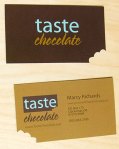
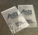
Set some high standards for yourself.  Remember, something as simple as your business card, letterhead and envelope will reflect greatly on your business.  Get it done right.  Seek the highest quality.If you’re interested in talking more about a good, quality identity package, Raygun can introduce you to a vast world of options that will enhance your brand from the first look and feel.  Contact me at hi@raygunprint.com.   And now, for your entertainment, here a few innovative business card designs:

Designing Relief Shelters

I’d like to introduce my friend, and Raygun Print client, Rafael Smith.  Raphael is the developer of the Uber Shelter, an entrepreneurial venture that seeks to provide temporary relief shelters to displaced persons around the world.  His prototype has gained international attention, as well as interest from relief agencies in Haiti to purchase thousands of his shelters.

Currently, Raphael is completing a 10-week fellowship with The Unreasonable Institute to refine and develop his product, and perhaps gain the funding he needs to manufacture the Uber Shelters for the real-world.

This is a remarkable example of design changing the world.  Below is a link to an episode from The Unreasonable Institute that features Raphael and Uber Shelter.

WATCH: Unreasonable Institute:  Wrench, Rachet, Raphael

Social Media: Where Everyone Is Living

Most people are NOT living on buses, staring at ads on the wall, and getting convinced to buy Product X or join Group Y.  No, they’re online.  It’s where an incomprehensible number of people live.  Seriously.  It’s not a digital address book or a casual form of entertainment.  It has become a part of our every day lives.  There’s a reason why the last Super Bowl was the first year Pepsi decided NOT to drop millions on a half-time commercial.  Who’s watching TV?  People are no longer influenced by it.  Thanks to social media, we’re actually influenced by one another.
Here’s how it works:
  • They’re seeing what their friends “like”.
  • Their friends “like” Product X.
  • Their friends tweet about Group Y.
  • They click on links about X and Y.
  • They anonymously research what they would like to know about X and Y.
  • They’re convinced enough to purchase Product X or join Group Y.
  • This is not because of a flashy bus ad, but because people they trust or respect endorse those products or groups.
Look at the numbers below.  Everything has changed.  Now, I need to make it clear that conventional print and advertising isn’t dead, if properly targeted and applied.  However, all of it is worthless if you’re not living where everyone else is.
  1. If Facebook were a country, it would be the third most populated in the world, ahead of the United States. Only China & India are more populated.
  2. 500 BILLION. The number of minutes spent on Facebook per month. LAST YEAR, THAT NUMBER WAS A MEASLY 150 BILLION.
  3. The amount of content 25 BILLION. (web links, news stories, blog posts, notes, photos, etc.) shared each month on Facebook. THAT’S MORE THAN 6X LAST YEAR’S VOLUME.
  4. 500 BILLION. The number of peer influence impressions Americans generate per year via social media. 62% of those impressions come from Facebook.
  5. 24 HOURS. The amount of video uploaded to YouTube every minute. THAT’S MORE THAN DOUBLE LAST YEAR’S VOLUME..
  6. 2 BILLION. The number of YouTube videos viewed per day. THAT’S TWICE AS MANY AS LAST YEAR.
  7. 4 BILLION. The number of images hosted on Flickr. THAT’S 13X MORE THAN THE LIBRARY OF CONGRESS.
  8. ONE-THIRD. The proportion of women aged 18-34 who check Facebook when they first wake up—even before going to the bathroom.
  9. NINETY-FIVE. The percentage of companies using LinkedIn to find and attract employees. 59% use Facebook and 42% use Twitter.
  10. 1 in 6. The number of marriages last year between people who met through social media. THAT’S MORE THAN TWICE THE NUMBER OF PEOPLE WHO MET AT BARS, CLUBS, AND OTHER SOCIAL EVENTS COMBINED.
  11. 27 MILLION. The average number of “tweets” per day on Twitter. THAT’S 8X LAST YEAR’S VOLUME.
  12. 7 HOURS. The time it took for LeBron James to amass his first 150,000 Twitter followers. It took Bill Gates 8 hours to reach 100,000.

Creative Shopping Bags

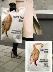
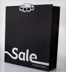
Here are some businesses making creative statements with the every day shopping bag.

How to Create a Media Plan in 6 Easy Steps

The following article was written by my friend and neighbor, Gunes Yilmaztuerk, of Sollé Coaching.

Every businesses uses some form of Marketing. Word of Mouth. Internet. Social Media. Videos. Podcasts. Commercials. Newspaper Ads. Magazine Ads. The possibilities are only limited by our imagination – and maybe technology.
As I’m sitting here with my laptop, preparing a marketing and media strategy for a client, I realize that what every business does not use is a media plan. Why not? No time? This is one excuse I don’t believe in. No experience? No knowledge? No guidance? No template? Not understanding the need or the purpose? These reasons sound more viable.

So, without much ado, let me help you and let’s get to putting together a media plan for you.

First: Why do you need a plan?
– How else can you plan your spending?
– How else can you systemize your outreach?
– How else can you verbalize your goals?
– How else can you track what is working and thus invest your money more efficiently?

Second: What needs to be in a media plan?

1) Goals: Why do you want to advertise? What do you want to achieve that is reasonable within your budget. Be specific (with goals and budget!). Have measurable goals.

2) Target Audience: Who do you want to reach and why? What are the demographics? Is it broad or highly targeted? Geographic-specific?

3) Message: What do you want your audience to hear and think? Why should they care? Your mission, goals, and the needs/wants of your target audience should be taken into consideration.

4) Media List: Which media outlets do you need? Who in the media do you need to contact? List the appropriate channels and the people (reporters) and their contact info.

5) Frequency: How often do you want to reach your audience with each media outlet?

6) TimeLine: List “Who – What – When – Which Outlet”. This list should include who is accountable for which task (finalize design, finish script, etc.), when the deadlines are, what the milestones are. Someone on your team should monitor this list regularly and keep team members accountable. It can be a simple excel sheet, a timeline, or an outline with project planning software. Main thing is – get your roadmap in writing.

OK, you could stop there. You’d have a great media plan. But you still need to know what worked and what didn’t. So here is the bonus step:

7) Accountability Report: Have all the timelines been achieved? Have the goals been achieved? Which media outlets worked? Which ones didn’t? Gather all the data you have, analyze it, and change your strategy accordingly.

And voila – you have your media plan. Does it take a bit of work and planning? Sure. But can you see how this might improve the efficiency of your investment? How could a media plan help your business? What has stopped you so far?

The Marketing Power of the Graphic T-shirt

Custom t-shirts have been a favorite branding tool for many years, but it’s not until recently that the price have come down enough to make it worthwhile for smaller customers to participate. Online custom t-shirt shops allows more people the chance to showcase their creativity on a living canvas.

Think about it, how long a lifespan does a flyer campaign have? A newspaper ad? Then consider the fact that retro t-shirts from the 70’s and 80’s are still selling better than ever. With a t-shirt campaign, people may be wearing your message for years to come. We all have that special t-shirt that reminds us of something in the past. We’ll wear it until it literally falls of our shoulders. That’s the power of custom t-shirts.

This is a time of individual branding. We show our unique style and personality in everything we do, from which cell phone we use, to what color our iPod is, but most importantly, we use clothing to show who we are. Custom t-shirts fit the bill. It’s a cheap, fun and inclusive way of letting your audience know who you are and what you stand for.

It’s now cheaper than ever to get custom printing done. This is mostly because of the online print shops, which can save money on stock and staff, because they run their business online. Custom t-shirt printing is no different. The price is low, shipping is cheap, as low as a few dollars for smaller orders and no more than $20 for bulk orders. You simply can’t do better than that in the brick and mortar print shops.

Why t-shirts? Why not get a custom bag or coffee mug? Well, first of all, no one wears their coffee mug around with them all the time. The t-shirt with print however, has become an integral part of everyday fashion. It’s all good and fine to get pens and coffee mugs with your message on them, but you won’t reach the same audience that you will with the iconic custom print t-shirt. Express yourself!

Getting a custom t-shirt printed is a fun way to be creative and bring a group together. It’s also a very effective way of showcasing that designer within you! A t-shirt is like a living canvas, urban art and communication all in one.

If you’re interested in getting t-shirts printed, I’d love to answer your questions.  Please contact me, or go to www.raygunprint.com